So you’ve (probably) seen the list of new items Navisworks 2011, but I’m going to expand on this list in a series of posts. This first post will focus on the new Interface in Navisworks 2011.
If you’ve been using practically any Autodesk product the past couple years, you’ve probably become accustom to the Ribbon interface. For Navisworks 2011, the Ribbon is one of the first new things you will notice. Below are some screen shots of the new Ribbon…
The Home tab of the Ribbon includes many of the features that were found in the Edit pull-down in 2010 and it also includes a Tools panel that allows the user to turn on certain tools (or Control Bars). As in the other products, some Ribbon Panels have little arrows at the bottom to give the user access to additional tools. Take the Select and Search Panel (shown below)…hitting the little down arrow expands the panel and allows the user to change the Selection Resolution on the fly, without having to go into Global Options (which has changed location…see bottom image) This type of behavior is consistent throughout Navisworks. As you can see in the image, if a tool has a blue background to it, the tool/control bar is active. 
For the Viewpoint tab, this is really the tools specific to working with a Viewpoint. I don’t want to say there are a lot of new tools here, but there are some enhancements. Take the big button for Save Viewpoint and the drop-down list for the Saved Viewpoints. This allows the user to save and pick a saved Viewpoint without having to go to the Saved Viewpoints Control Bar. Sure, you still have to go to the Saved Viewpoints Control Bar to give a new Viewpoint a name, but it allows easier access later on. The other big item on the Viewpoint tab is the Enable Sectioning button. This will open an extra tab just for Sectioning. I’ll go into the Sectioning enhancements in a later post.
The Review tab gives you the tools for Measuring, Redlines, Tags and Comments. Not much in the way of changes for these tools.
The Animation tab is really for turning on Animator and Scripter, plus playback capability. You can get to the Record button in the Viewpoint tab, just hit the down arrow under the Save Viewpoint button.
The View tab allows you to turn on the Navigation bar (again more about this in a future post), the View Cube, Workspace Saving and Loading, etc. The Windows button is actually for turning on the various Control Bars. 
And last but not least, the Output tab. This basically give you all of the Export, Print and Publish options. It’s kind of nice not to have to go into the Application Button to get these options. Don’t know what the Application Button is…see paragraph below. :)
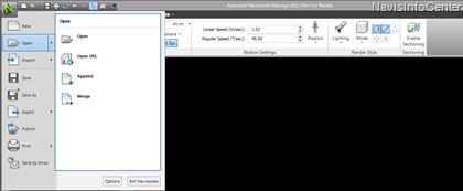
The Application Button/Menu in the upper left corner (or what I call the “Bin N”) get’s you into the “typical” New, Open, Print, etc. You’ll notice that some have a fly-out which will get you additional tools/options. And speaking of Options…I’ve gotten the question a few times already - “Where is the Global Options in Navisworks 2011?” Well, you’ll see a button in the lower right of the App Menu called Options…this is where you get to the Global Options.
So, that’s the new interface in a nutshell. I’ll expand on a few items in the near future. And speaking of the future…next on the list (other than expanding on the items stated above) is using the Classic interface! Yep, I said it…there is a classic interface for Navisworks 2011. And there are a couple “gotchas” with using the classis interface.

No comments:
Post a Comment